> ## Documentation Index
> Fetch the complete documentation index at: https://committ.mintlify.site/llms.txt
> Use this file to discover all available pages before exploring further.
# December 23rd, 2025
> The day we separated Start Verification from actual proof. A clear, two-step discipline checkpoint.
# December 23rd, 2025
**The Day We Made Verification a Two-Step Commitment**
Today was not about adding more features. It was about making the verification flow honest, explicit, and impossible to misunderstand. We separated acknowledging a commitment from actually proving it.
***
## Where Verification Starts
**Q: What do I see when I open the app?**
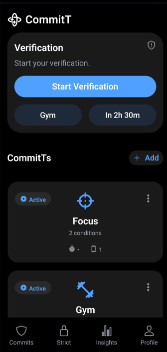
When the app opens, the first thing visible on the home screen is the **Verification card** at the top.
It is not aggressive. It simply shows:
* A title: "Verification"
* A short line: "Start your verification."
* One clear call-to-action: **Start Verification**
* Context about what is coming, for example:
* Gym
* "In 2h 30m"
Even before doing anything, the user knows what is coming and when.
***
## What Start Verification Actually Means
**Q: Does Start Verification verify anything immediately?**
No.
Tapping **Start Verification** does not verify anything yet. It is the user saying:
> "I acknowledge this commitment. I am stepping into verification mode."
From there, the flow moves to the **Verify Your Commits** screen.
***
## The Verify Your Commits Screen
**Q: What does the verification screen look like?**
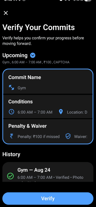
At the top, the screen is intentionally minimal:
* Close icon
* Title: "Verify Your Commits"
* A short explanation that verification is about confirming progress before moving forward
There are no tabs or distractions. It feels like a focused checkpoint, not a dashboard.
***
## The Upcoming Section
**Q: How does the app remind me what I am about to be judged on?**
Just under the header, there is an **Upcoming** section.
It shows, for example:
* Gym
* 6:00 AM – 7:00 AM
* ₹100 penalty
* CAPTCHA waiver
There is a small dropdown indicator so it feels expandable, but even when collapsed it carries enough weight. It quietly says:
> "This is the commitment that will be verified."
***
## The Main Commit Card Structure
**Q: How is the commitment itself presented?**
The main commit card is split into three deliberate sections.
1. **Commit Name**
* Example: Gym, with an icon
* This gives the commitment an identity
2. **Conditions**
* Time window, location, proof type
* Shown with clear visual cues (clock, map pin, camera)
* No paragraphs, just structured signals of what counts and what does not
3. **Penalty and Waiver**
* Example: ₹100 penalty
* Example: CAPTCHA as the waiver
* This makes the consequence explicit, not implied
Each section is separated by strong dividers so it does not feel like a soft, generic card. It feels like a contract broken into terms.
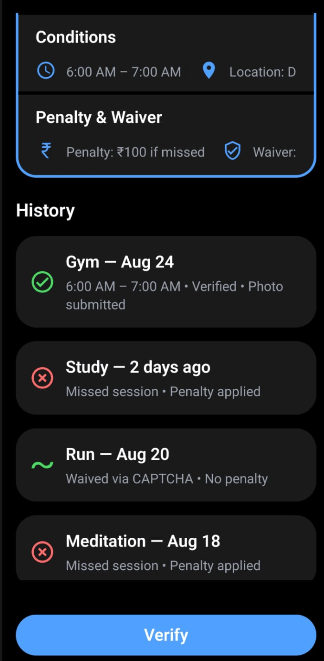
Below the card, a **History** section shows past outcomes:
* Verified
* Missed
* Waived
For example: "Gym — Aug 24 — Verified via Photo." Simple, factual, and permanent.
***
## Timing: Before the Window vs During the Window
**Q: What happens if I open this screen before the verification window?**
When the user arrives on this screen before the actual verification window:
* The commit card looks slightly inactive
* The **Verify** button at the bottom is visible but disabled
The message is clear:
> "You have started verification, but it is not time yet."
**Q: How is the Verify button presented?**
The Verify button is pinned to the bottom of the screen:
* Content scrolls
* The button remains fixed
It is always in view, but only becomes actionable at the right time.
***
## When the Window Opens
**Q: What changes when the correct time window starts?**
Once the verification window begins (for example, at 6:00 AM):
* The commit card gains a clear active state
* The Verify button becomes enabled
At that moment, the screen is essentially saying:
> "Now it is time. Prove it."
This is when tapping **Verify** actually triggers verification: photo, video, or whichever proof condition was chosen.
***
## Two-Step Intent: Start Verification vs Verify
**Q: Why separate Start Verification and Verify?**
Because they represent two different actions:
* **Start Verification**\
The user acknowledges the commitment and enters the verification flow. It is preparation.
* **Verify (at the correct time)**\
The user proves they did the work. It is evidence.
This separation matters for two reasons:
1. The user cannot accidentally verify early.
2. The user cannot claim they were unaware of what was coming.
The system enforces both awareness and timing.
***
## Why This Feels Like a Discipline Checkpoint
**Q: How is this different from a normal app flow?**
Most apps treat verification as another action: tap a button, toggle a state, mark something as done.
In this flow:
* The user first sees what they promised
* They see what is at stake
* They wait until the verification window opens
* Only then can they prove it or accept the consequence
It feels less like navigation and more like standing at a checkpoint:
* Before it: flexibility and planning
* At it: pressure and decision
* After it: record and consequence
That boundary is what we built today.
***
## What We Actually Built Today
**Q: What is the real outcome of today's work?**
We did not add cameras, sensors, or backend enforcement yet.
Instead, we:
* Defined the start of verification as a conscious acknowledgment
* Separated that from the actual act of proving
* Structured the UI so the user always understands:
* What will be verified
* When it will be verified
* What happens if they do not follow through
We built a clear, two-step discipline checkpoint into the product.
***
## Proof of Work