> ## Documentation Index
> Fetch the complete documentation index at: https://committ.mintlify.site/llms.txt
> Use this file to discover all available pages before exploring further.
# December 24th, 2025
> The day we made failure feel real. Adding tangible consequences, real stakes, and earned escapes.
# December 24th, 2025
**The Day We Made Failure Feel Real**
So today, the whole focus was on **making failure feel real** in CommitT — not just some abstract "you missed it" message, but something that actually hits you.
***
## The Penalties Screen
**Q: How does the new Penalties screen set the tone?**
It starts here. The app basically looks at you and says:
> "Cool, you want to commit? Fine. What are you willing to lose if you screw this up?"
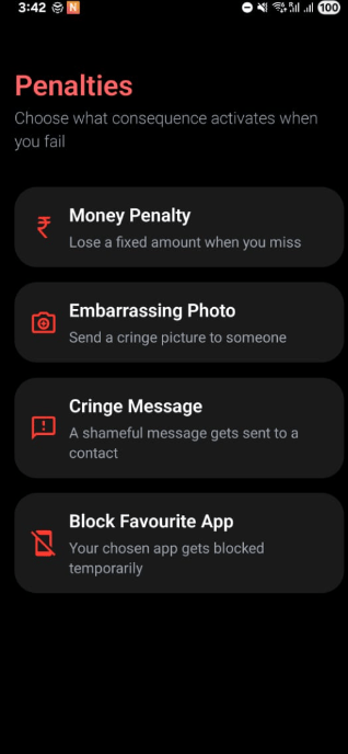
Instead of just money, we laid out **multiple types of consequences** in a very blunt, no-nonsense way:
* **Money**: You lose cash.
* **Embarrassment**: You are forced to send an embarrassing photo or cringe message.
* **Digital Access**: We temporarily block your favorite app.
Nothing fancy here — the UI is intentionally serious. Dark background, sharp icons, clear wording. It is meant to feel uncomfortable on purpose, because penalties *should* feel uncomfortable.
 ***
## Setting the Stake
**Q: How do we make the stake feel "real" before payment?**
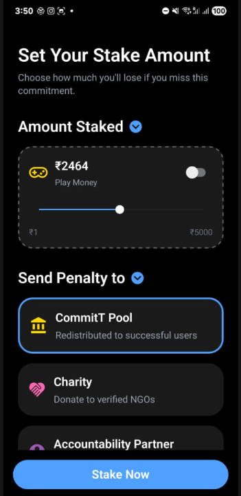
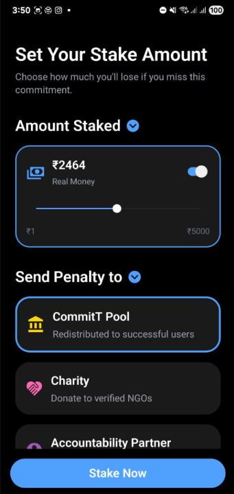
Once you pick a **Money Penalty**, the flow tightens. You land on the **"Set Your Stake Amount"** screen.
This is where things stop being theoretical. There is a slider — simple, tactile — and as you move it, you literally *see* the number going up. ₹500… ₹1200… ₹2464… At that point, it’s not "points" or "coins". It’s real money.
We even added that subtle **"play money" toggle**, which makes it very obvious:
> "This can be pretend… or this can be real."
That contrast matters. It psychologically separates people who are just exploring from people who are actually committing.
***
## Where the Penalty Goes
**Q: Doesn't it feel scammy if the app just keeps the money?**
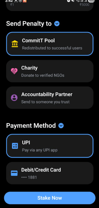
Yes, which is why the **Payment Method** section had to be handled carefully.
Instead of the app keeping the money, we give clear options:
* **CommitT Pool** – your lost money gets redistributed to people who actually succeeded.
* **Charity** – goes to verified NGOs.
* **Accountability Partner** – sent to someone you trust.
This is huge, because now failing doesn’t just hurt you — it *rewards discipline elsewhere* or *embarrasses you socially*. That is real pressure.
Finally, we lock it in with **Payment Method**. UPI, card — nothing fancy, just clear and direct.
At this point, if someone taps that big **"Stake Now"** button, they’ve crossed a line. They are no longer "trying an app". They’ve put skin in the game.
***
## Earned Escapes: The Waiver
**Q: Is there any hope if I fail?**
We introduced the idea of **Penalty Waivers** — not freebies, but **earned escapes**.
So if you fail, you *might* still save yourself… but only by suffering in a different way.
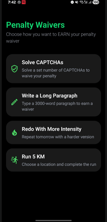
The waiver screen feels different. Green instead of red. Same dark tone, but now it says:
> "Okay, you messed up. How badly do you want redemption?"
You can:
* Solve CAPTCHAs (not just one, but many).
* Write a ridiculously long paragraph.
* Redo the task with higher intensity.
* Run 5 KM.
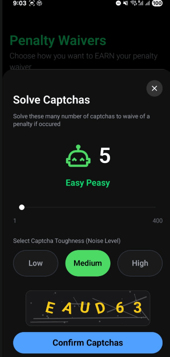
**The CAPTCHA Waiver**
This isn’t some lazy checkbox. It opens a **modal**, so it feels serious. You choose the count and difficulty. As you increase the count, the UI explicitly labels it — "Easy Peasy" now… but clearly hinting it won’t stay that way.
***
## Summary
**Q: Ideally, what did we achieve today?**
Today wasn’t about features — it was about **turning commitment into something you can’t mentally escape from**.
Money hurts. Embarrassment hurts. Effort hurts. And the UI we built today makes sure the user *feels that* at every step.
The flow is coherent, psychologically sharp, and doesn’t feel gimmicky. The only risk is overloading users too early, so we need to find the right onboarding moment. But overall, a very strong product day.
***
## Setting the Stake
**Q: How do we make the stake feel "real" before payment?**
Once you pick a **Money Penalty**, the flow tightens. You land on the **"Set Your Stake Amount"** screen.
This is where things stop being theoretical. There is a slider — simple, tactile — and as you move it, you literally *see* the number going up. ₹500… ₹1200… ₹2464… At that point, it’s not "points" or "coins". It’s real money.
We even added that subtle **"play money" toggle**, which makes it very obvious:
> "This can be pretend… or this can be real."
That contrast matters. It psychologically separates people who are just exploring from people who are actually committing.
***
## Where the Penalty Goes
**Q: Doesn't it feel scammy if the app just keeps the money?**
Yes, which is why the **Payment Method** section had to be handled carefully.
Instead of the app keeping the money, we give clear options:
* **CommitT Pool** – your lost money gets redistributed to people who actually succeeded.
* **Charity** – goes to verified NGOs.
* **Accountability Partner** – sent to someone you trust.
This is huge, because now failing doesn’t just hurt you — it *rewards discipline elsewhere* or *embarrasses you socially*. That is real pressure.
Finally, we lock it in with **Payment Method**. UPI, card — nothing fancy, just clear and direct.
At this point, if someone taps that big **"Stake Now"** button, they’ve crossed a line. They are no longer "trying an app". They’ve put skin in the game.
***
## Earned Escapes: The Waiver
**Q: Is there any hope if I fail?**
We introduced the idea of **Penalty Waivers** — not freebies, but **earned escapes**.
So if you fail, you *might* still save yourself… but only by suffering in a different way.
The waiver screen feels different. Green instead of red. Same dark tone, but now it says:
> "Okay, you messed up. How badly do you want redemption?"
You can:
* Solve CAPTCHAs (not just one, but many).
* Write a ridiculously long paragraph.
* Redo the task with higher intensity.
* Run 5 KM.
**The CAPTCHA Waiver**
This isn’t some lazy checkbox. It opens a **modal**, so it feels serious. You choose the count and difficulty. As you increase the count, the UI explicitly labels it — "Easy Peasy" now… but clearly hinting it won’t stay that way.
***
## Summary
**Q: Ideally, what did we achieve today?**
Today wasn’t about features — it was about **turning commitment into something you can’t mentally escape from**.
Money hurts. Embarrassment hurts. Effort hurts. And the UI we built today makes sure the user *feels that* at every step.
The flow is coherent, psychologically sharp, and doesn’t feel gimmicky. The only risk is overloading users too early, so we need to find the right onboarding moment. But overall, a very strong product day.